Junk mail. Meh.
Sometimes, it feels like the stuff being stuffed (see what I did there?) through your letter box, has already been given up on. They’ve already accepted that its headed to the recycling box, but for some reason, they felt it deserved a visit to your doormat beforehand. Like it should see more of the world, because damn it, they spent whole minutes putting it together.
So, they spent their valuable marketing budget letting some intern at a print shop get their big break writing and designing their flyer for them. After all, what could possibly go wrong?
Everything.
Let’s take this amazing piece of work that hit the mat just this morning.
I first wanted to pull this thing apart on the simple fact that, despite 2018 being nearly upon us, there are businesses out there till thinking that marketing yourself as ‘female friendly’ by making material pink and incredibly patronising is going to work. Or should that be patriarch-onising?
Are you a woman? Have you forgotten your MOT date is on the certificate? Do you have no idea that an MOT centre that had a commission based service on MOTs, a dedicated sales team, or middlemen would be really weird, or at the very least overkill? Then come to us! We’ll even tell you to put this reminder on your board or fridge in the kitchen (as that’s where you spend all your time right?). And best write the appointment down – after all, all the space in that pretty little head of yours is taken up by shoes.
Come on guys (I’m presuming they’re guys), let’s raise the game a little here. I mean, some of this is actually quite useful and helpful – but surely regardless of gender? I forget stuff all the time. Ironically, I wish I could forget this flyer, but that doesn’t seem likely now.
It doesn’t matter that there are four stars in front of the words ‘five star rating’ (I know, there is another star on the flyer, but really?), or that there are so many sales messages here, the only thing standing out is the misogyny. Or that there is a completely superfluous dotted green line (am I cutting something out?), or that it looks like they’ve given each individual word its own typeface.
What matters, is that they’ve paid for this junk. Presumably, this met their standards of excellence. It nailed their brief. They were happy to pony up the dough.
Which surely means, under no circumstances, should you ever take your car to them? Honestly, it’d be like going to a doctor who lets their house plants die.
If you’re thinking of putting together marketing material, less is always more. Fewer words. Fewer images. Fewer messages. White space does not have to be filled. You do not have to write war and peace. And you do not have to convey your entire manifesto. Choose one key message and stick to it.
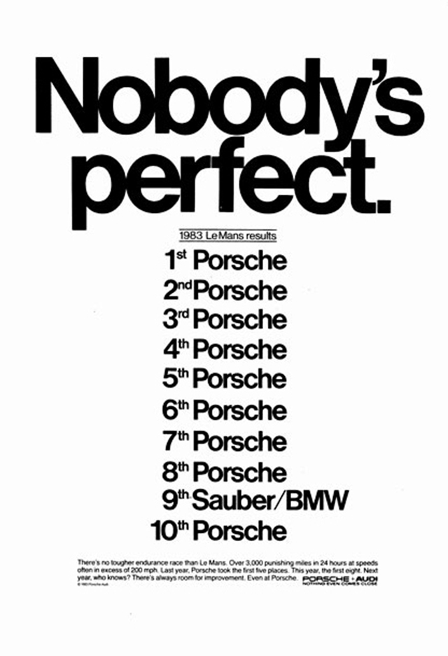
Below is probably the most perfect advert Porsche have ever created.

No images. No need to fill space. And a perfect headline that’s also a punchline. This shows that Porsche not only know their audience, but also how they are perceived as a brand beyond it. And that lets them communicate effectively to both.
So, next time you’re headed to the lowest bidder for all your marketing needs, I ask you to consider one thing. Should you cut out the middle-person and head straight for the recycling centre?
Okay, two things then. Could you spend your money more wisely and make your budget deliver a better ROI by going somewhere else?
The final point? Junk mail is only junk mail if you make it so.

